Music Discography Carousel
Mini Case Study
Disco beats, striking imagery, and a homage to past hitmakers have been some of the hallmarks of international music DJ and producer Purple Disco Machine (PDM). He is beloved by his fans worldwide and has created and remixed numerous international hit songs. His vibrant brand colors and positive energy are infectious and fun.
When I first started to create a mockup for a music album pre-order mobile site, I knew I wanted to fully dive into Purple Disco Machine's style and create a mobile site that represented his brand and drew users in. The scroll wheel concept came to me early on. Round elements, round icons, circular movements - I knew I wanted these to be the heart of the project. The music discography section seemed to be the perfect placement to really allow the users to dive in and interact with the site while offering enjoyable engagement and learning more about PDM as an artist.
From start to finish, the discography scroll wheel grew and evolved to take on a life of its own, and became the heart of the project as I had envisioned. Below is the journey that brought it to life.
Challenge:
To create a functional scroll wheel within the main Music Album Pre Order Mobile Site that could serve as a functional Discography. The concept was to create something that was fun, interactive, on-brand, and also provide the user with information on past and present music created by the music this artist (Purple Disco Machine). Matching proper text copy and music icons with smooth scrolling animation would be key to relaying accurate information while keeping the user engaged.
Ideation:
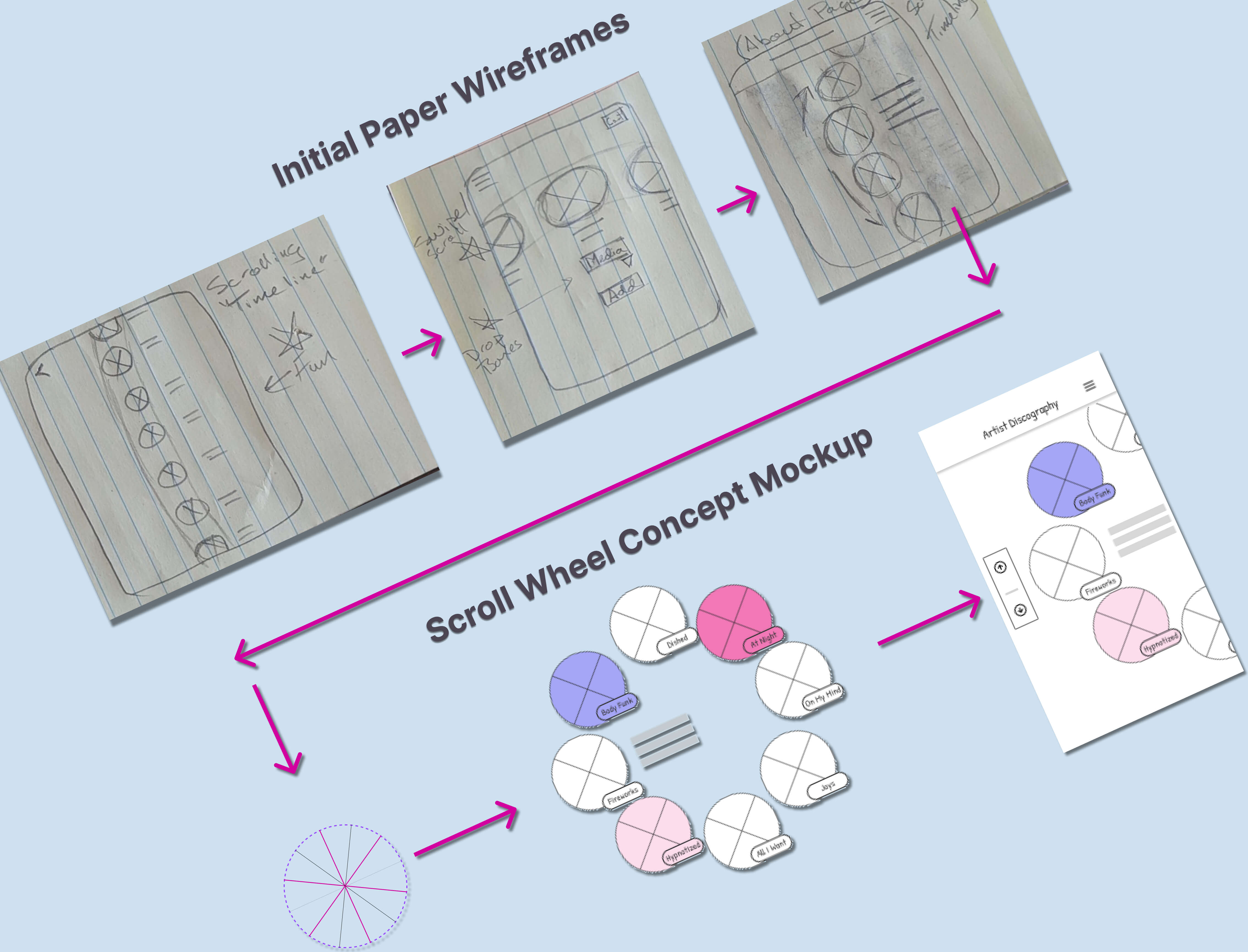
In early sketches, I was drawn to curved and round shapes that later made up the scroll wheel. The smooth flow of a rotating/turning wheel reminded me of rotary phones of the past. Or perhaps a child's toy. Nostalgia. Bringing these feelings and elements into the discography section of this site seemed to create a space of entertainment and enjoyment that is at the core of what Purple Disco Machine brings to the dance floor as a music artist.
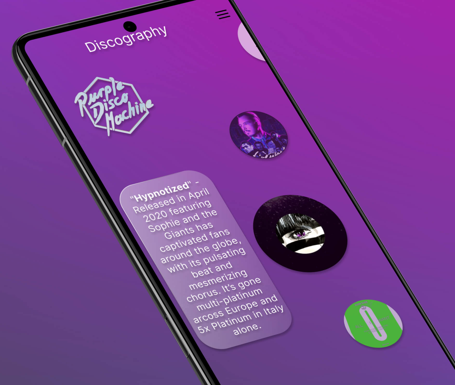
Beneath, you can see some of the steps taken to bring this wheel from paper to prototype. Early sketch concepts focused on orientation and direction. What allowed the most space to create a visual impact, but still be functional for the user? What orientation allowed the scroll wheel to fit on the page? Pretty quickly it became obvious that the most visual information and imagery would be allowed on the screen if the scroll wheel was centered just off the screen and scrolled vertically.
Workflow - Prototpying:
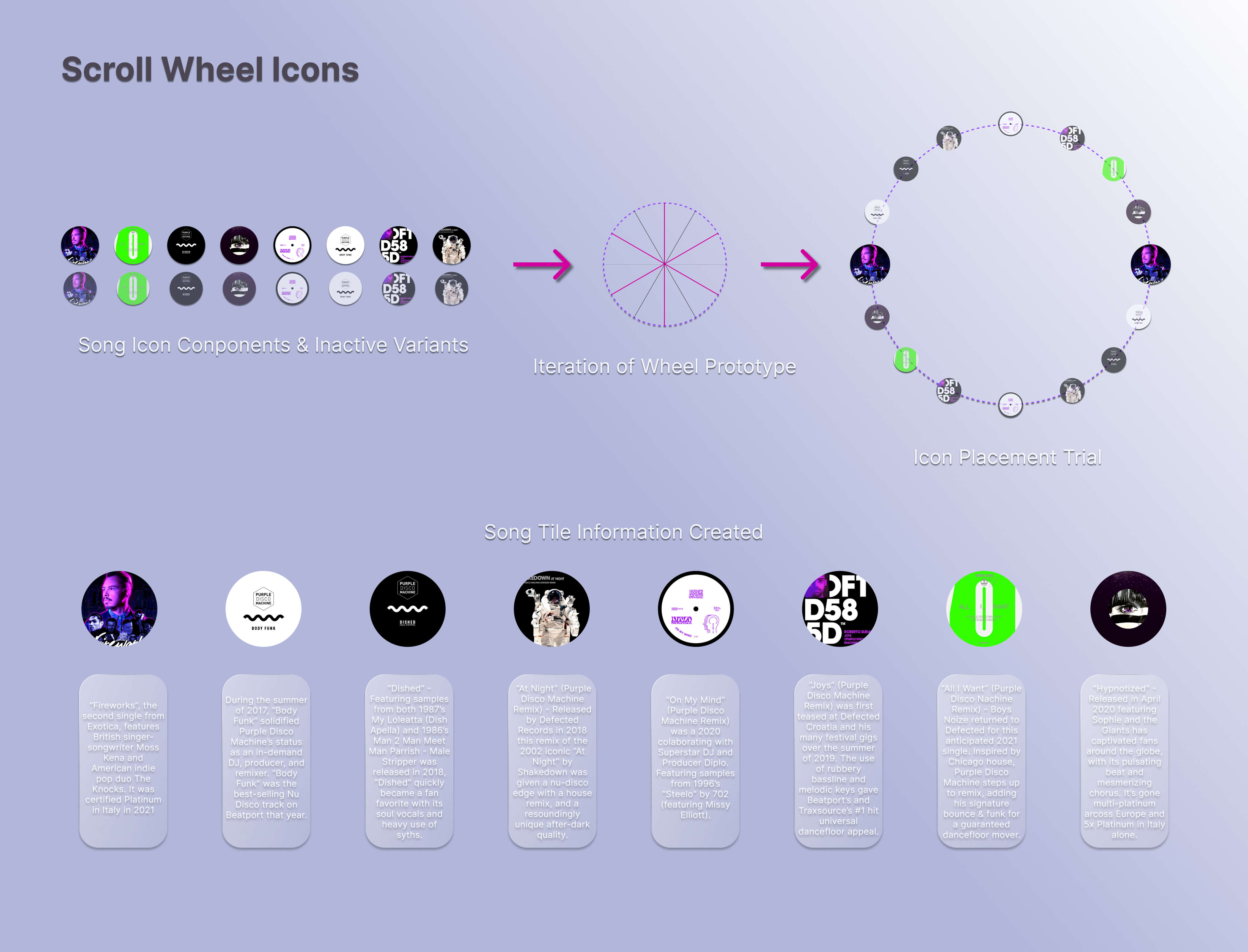
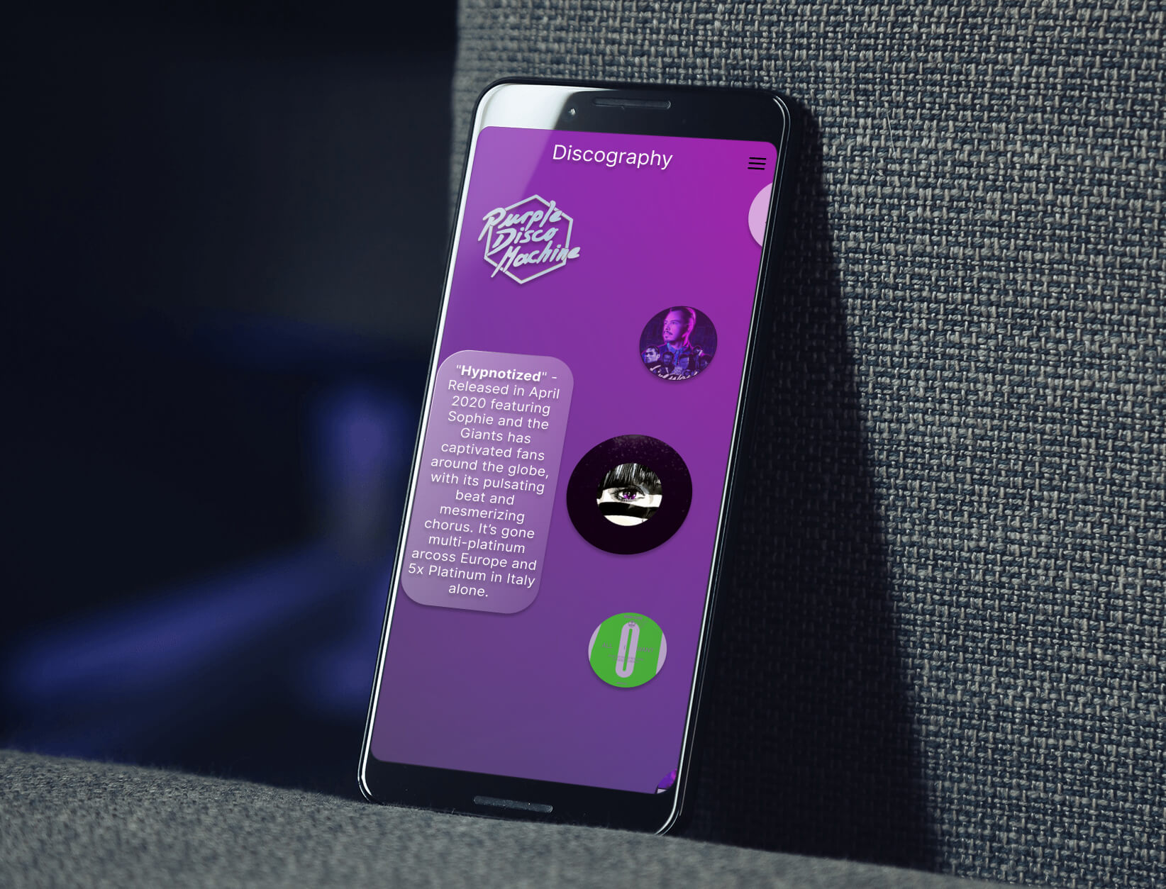
(Below) Once the the general orientation was chosen, the process of refining the prototypes began. Mockups and high-fidelity prototype elements were created, planned, and placed. The wheel and the rotation were thought out. It was decided that the placement of the song text and copy would be centered to the left of the image. No labels would be used on top of the rotating icons. Copy would dissolve and appear with its corresponding icon. This was chosen to give a clean, sleek look to the icons, and also reduce potential copy redundancy.
Next, the song icon images themselves were created and turned into components (active and inactive). The copy for the individual songs was created and placed on individual panes.
Because of the placement of the copy, it was decided that the arrow buttons used to rotate the scroll wheel would be eliminated. Drag functionality was added to the song icons themselves to give the users another level of interaction.
The primary image circles, copy, and the wheel were now coming to life, eventually rotating on and off the screen, giving the user new information on each song selection.
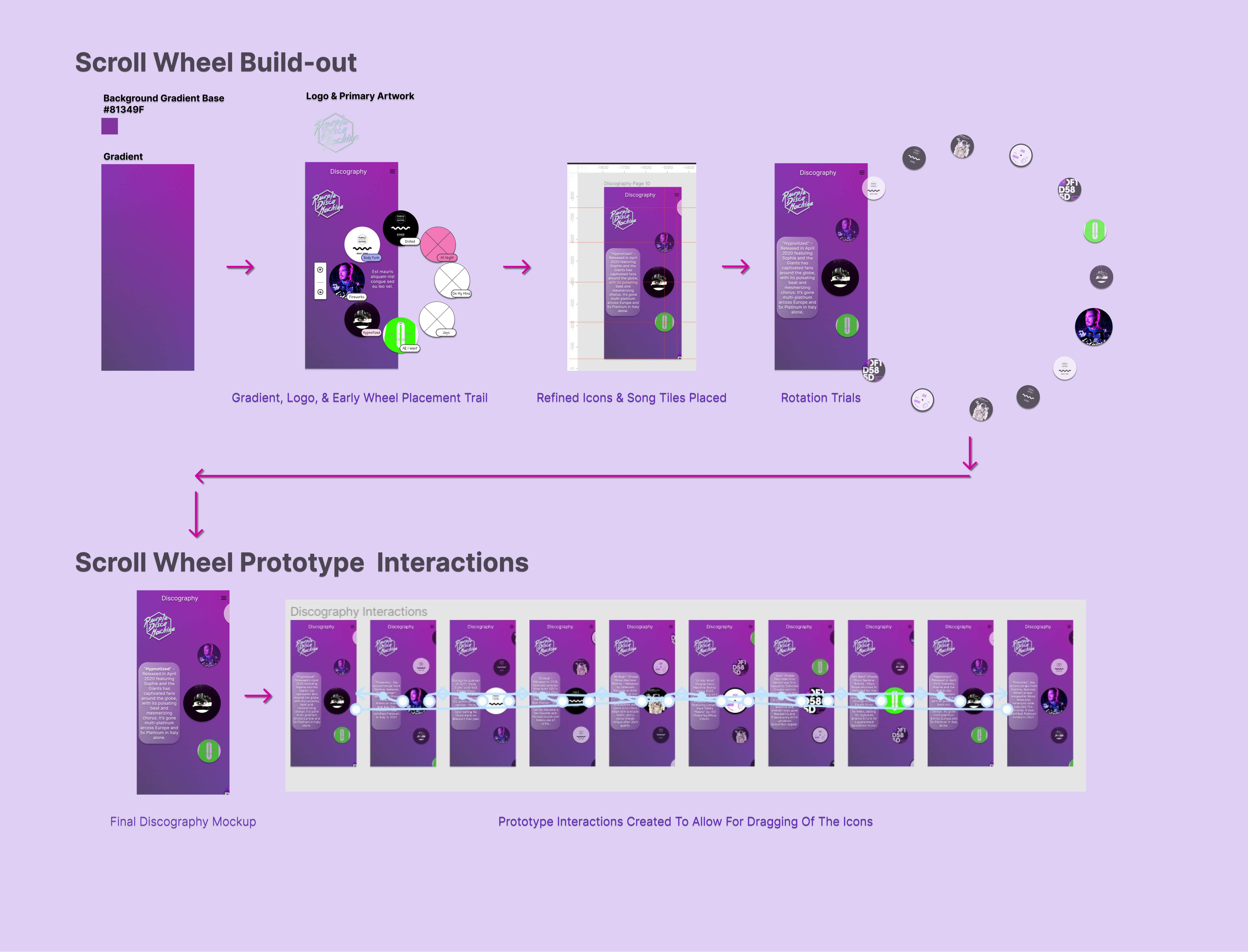
Below you can see that the primary color gradient was added and high fidelity placements were trialed and finalized. Finally, the prototype interactions were created to give the wheel its rotating capabilities.
Outcome:
The final version of the scroll wheel that was created for the Purple Disco Machine project is fun, engaging, and has the nostalgia I was hoping for. The wheel itself gave the entire project soul and was a project of passion. It incorporates the music and style that fans are so drawn to and my hope is that this playful element comes across to the user for a fun, informative, and user-friendly experience. To see the entire Purple Disco Machine Album Pre-Order Case Study click here.

Music Discography Carousel
Mini Case Study
Disco beats, striking imagery, and a homage to past hitmakers have been some of the hallmarks of international music DJ and producer Purple Disco Machine (PDM). He is beloved by his fans worldwide and has created and remixed numerous international hit songs. His vibrant brand colors and positive energy are infectious and fun.
When I first started to create a mockup for a music album pre-order mobile site, I knew I wanted to fully dive into Purple Disco Machine's style and create a mobile site that represented his brand and drew users in. The scroll wheel concept came to me early on. Round elements, round icons, circular movements - I knew I wanted these to be the heart of the project. The music discography section seemed to be the perfect placement to really allow the users to dive in and interact with the site while offering enjoyable engagement and learning more about PDM as an artist.
From start to finish, the discography scroll wheel grew and evolved to take on a life of its own, and became the heart of the project as I had envisioned. Below is the journey that brought it to life.
Challenge:
To create a functional scroll wheel within the main Music Album Pre Order Mobile Site that could serve as a functional Discography. The concept was to create something that was fun, interactive, on-brand, and also provide the user with information on past and present music created by the music this artist (Purple Disco Machine). Matching proper text copy and music icons with smooth scrolling animation would be key to relaying accurate information while keeping the user engaged.
Ideation:
In early sketches, I was drawn to curved and round shapes that later made up the scroll wheel. The smooth flow of a rotating/turning wheel reminded me of rotary phones of the past. Or perhaps a child's toy. Nostalgia. Bringing these feelings and elements into the discography section of this site seemed to create a space of entertainment and enjoyment that is at the core of what Purple Disco Machine brings to the dance floor as a music artist.
Beneath, you can see some of the steps taken to bring this wheel from paper to prototype. Early sketch concepts focused on orientation and direction. What allowed the most space to create a visual impact, but still be functional for the user? What orientation allowed the scroll wheel to fit on the page? Pretty quickly it became obvious that the most visual information and imagery would be allowed on the screen if the scroll wheel was centered just off the screen and scrolled vertically.
Workflow - Prototpying:
(Below) Once the the general orientation was chosen, the process of refining the prototypes began. Mockups and high-fidelity prototype elements were created, planned, and placed. The wheel and the rotation were thought out. It was decided that the placement of the song text and copy would be centered to the left of the image. No labels would be used on top of the rotating icons. Copy would dissolve and appear with its corresponding icon. This was chosen to give a clean, sleek look to the icons, and also reduce potential copy redundancy.
Next, the song icon images themselves were created and turned into components (active and inactive). The copy for the individual songs was created and placed on individual panes.
Because of the placement of the copy, it was decided that the arrow buttons used to rotate the scroll wheel would be eliminated. Drag functionality was added to the song icons themselves to give the users another level of interaction.
The primary image circles, copy, and the wheel were now coming to life, eventually rotating on and off the screen, giving the user new information on each song selection.
Below you can see that the primary color gradient was added and high fidelity placements were trialed and finalized. Finally, the prototype interactions were created to give the wheel its rotating capabilities.
Outcome:
The final version of the scroll wheel that was created for the Purple Disco Machine project is fun, engaging, and has the nostalgia I was hoping for. The wheel itself gave the entire project soul and was a project of passion. It incorporates the music and style that fans are so drawn to and my hope is that this playful element comes across to the user for a fun, informative, and user-friendly experience. To see the entire Purple Disco Machine Album Pre-Order Case Study click here.